

Understanding Reports
Enchant comes with a set of build-in reports that gives you a view of the health of your support operations. You can use these to see which of your processes are working well, and where there's a room for improvements.
From the left navigation bar, click the pie chart icon to go the Reports page.

In the reports, all calculations are based on historical activity that occurred on the tickets. Replies are credited to the actual user that wrote the reply. The resolution of the ticket is credited to the user that responded to the customer, even if the ticket gets assigned to someone else afterwards. This helps us keep the numbers are more accurate when multiple users have worked on a single ticket.
For more details on how specific numbers are calculated, please look at the help article for that particular report type.
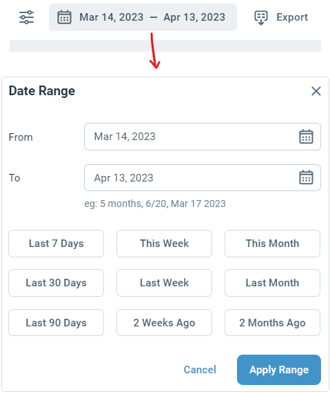
All reports run on a selected date range, that we call the Reporting Period. All the data and metrics are calculated for the historical activity that occurred within the reporting period that was selected.
By default, the last 30 day period is selected. You can change this by clicking the Date Range button in the top action bar. There are a handful of pre-set default ranges to pick from, and you can also select a specific range by clicking on the dates and choosing the start and end dates from the calendar. Once you're done changing the dates, click Apply Range to see the report data.
There are 4 types of reports available for Inbox operations. You can select a type from the sidebar menu:

Ticket Report: The ticket report shows support volume, busy trends, highlight common issues, and breakdown of different types of requests have you received during the reporting period.
Performance Report : The performance report gives you details about how your teams are performing and how productive they are in resolving the customers' issues.
Team Report: The team report shows the leaderboard and lets you drill further down into individual users of the team for a deeper analysis.
Happiness Report: The happiness report gives you an insight into customer happiness using their feedback data.
Pro Tip: You can even export the underlying report data to in CSV or Excel format to analyze it more deeply.
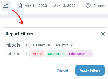
Filters look at what's currently on the tickets. You can filter tickets by label or by inbox. This reduces the set of tickets that the report is being generated on to those that currently have that label or are associated with that inbox.
When a filter is created for multiple labels, the report is generated for tickets which currently have either of those labels. Same goes when a filter has multiple inboxes.
Admins have access to all report data for all inboxes.
Non-admin users have access limited to just their own personal data for all the reports (including their performance report and also their own happiness report).
However, if a ticket came to your inbox from another inbox, you may see names of triggers, macros, labels or canned responses that were applied to the ticket while in the other inbox.